
Part way down this page about Gestalt principles, you will find the Gestalt Dalmation. You should check it out if you have not seen it. I went looking for the dalmation, but this is a great page overall. So, also check out the web examples.
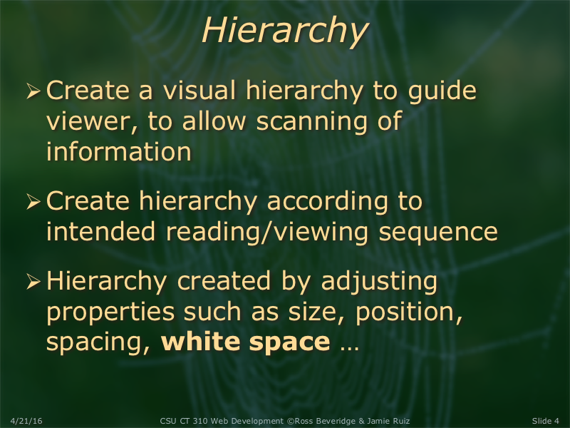
Some good notes about white space
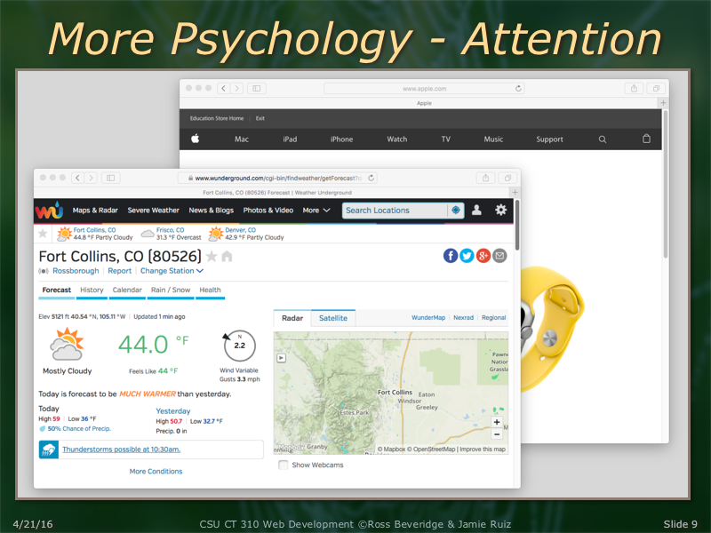
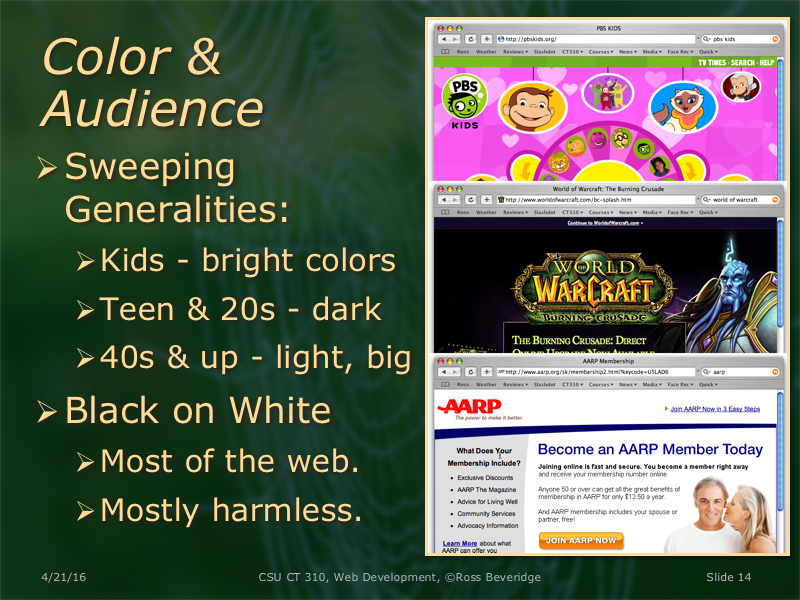
More psychology: Use of color. Cool stuff in my opinion.
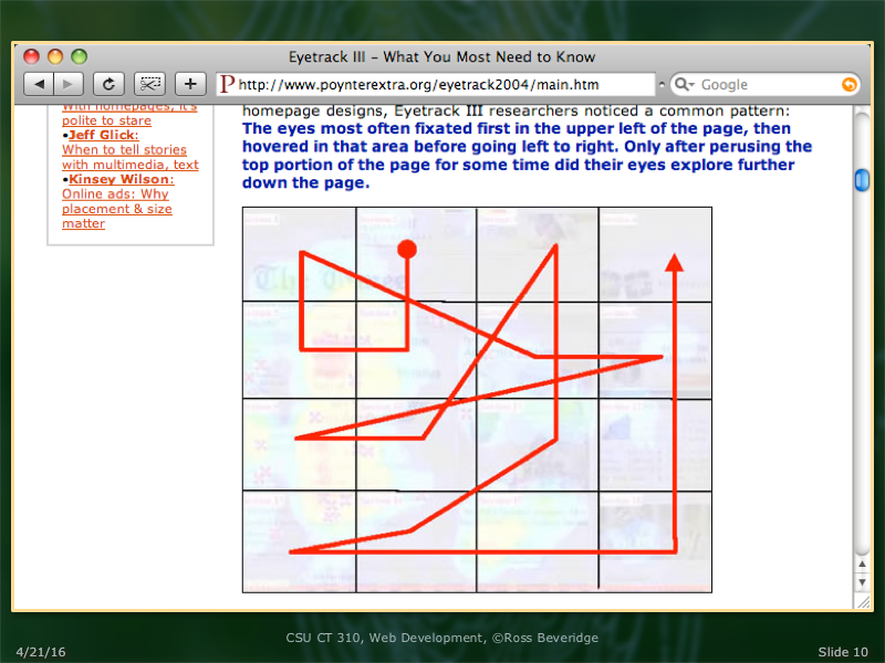
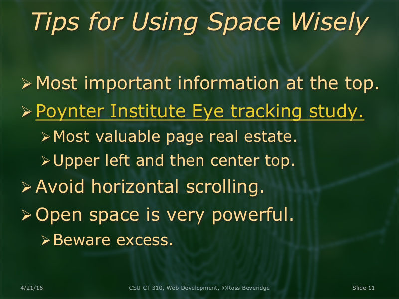
Some more information on eye tracking studies.

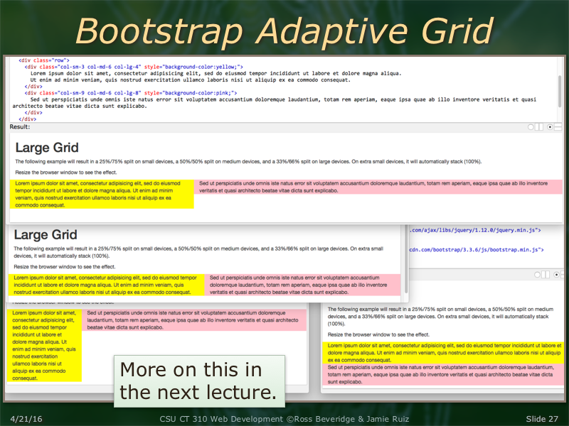
The Bootstrap example shown here can be found at the Bootstrap Grid Example: Large Devices as part of the first try it yourself example.
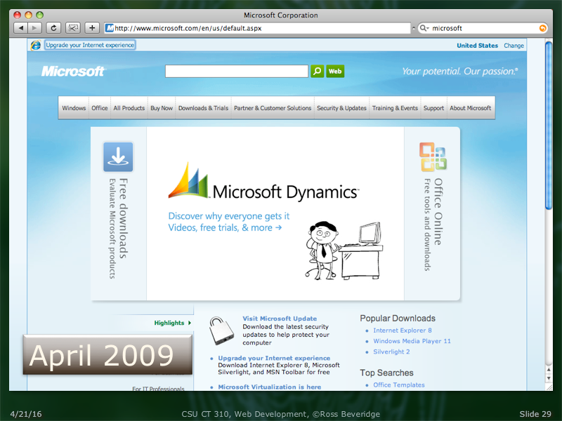
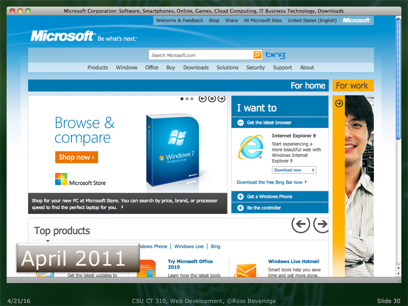
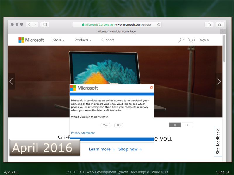
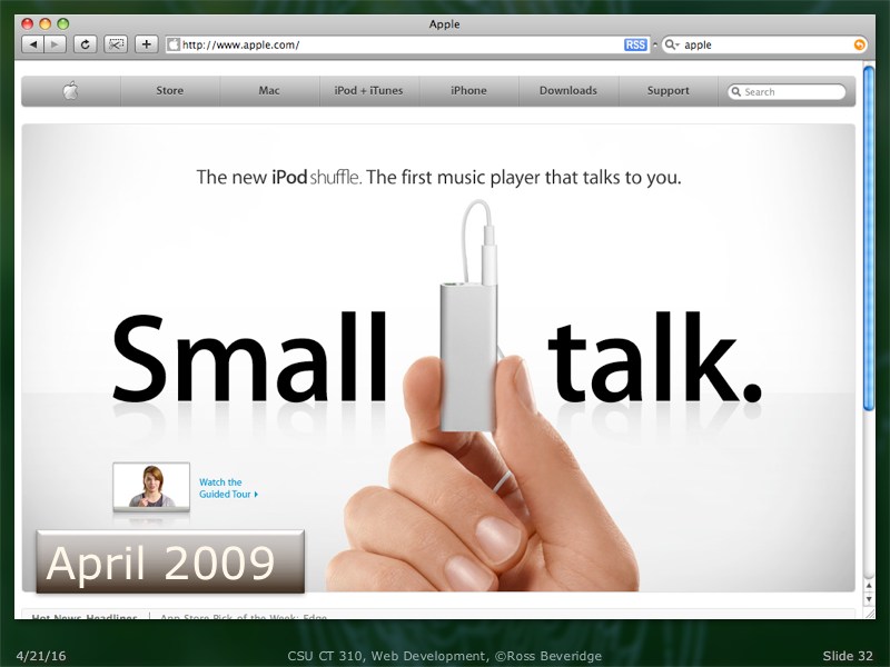
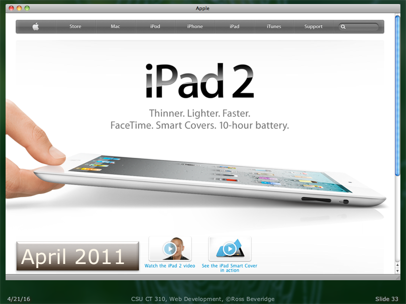
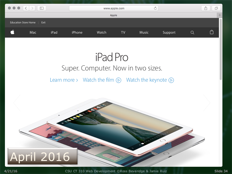
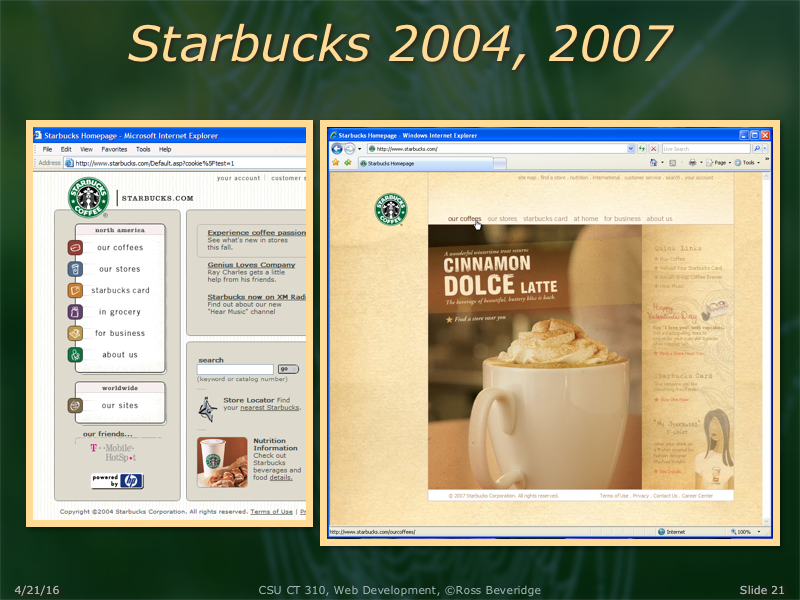
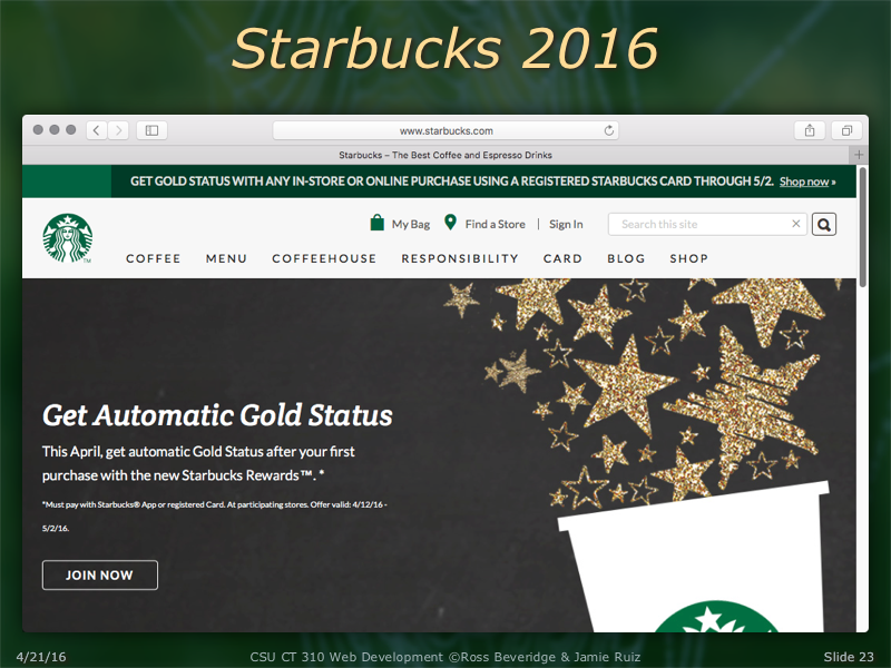
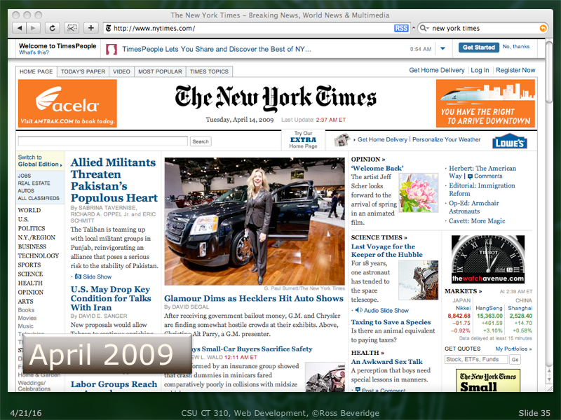
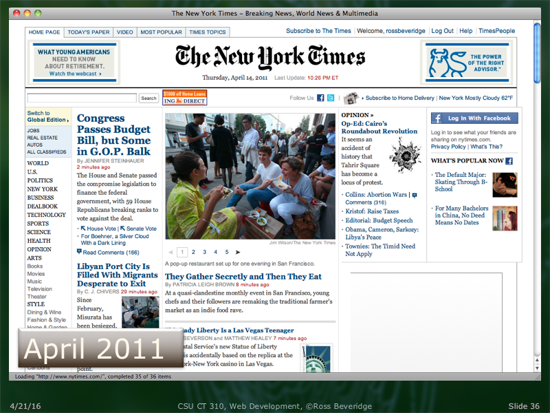
The changes are subtle, but note the top bar has changed to include an extra line at the very top. Also the navigation bar spans the page width and is visually less interesting; a simple flat toned box. This is consistent with modern style visually interesting touches such as bevels, lighting, etc. are by design excluded from consideration.
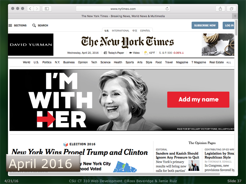
This recent screenshot tells it all. The New York Times has decided (been forced by economic necessity) to make paid advertising explicitly overshadow news content. Note when the page first appeared the prominent paid advertisement was not present, but it 'popped' into the page before the screen shot could be taken; hence what you see is what was shown.
Colorado State University, Fort Collins, CO 80523 USA
© 2016 Colorado State University

