

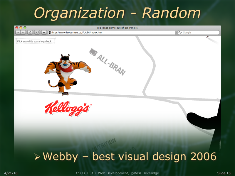

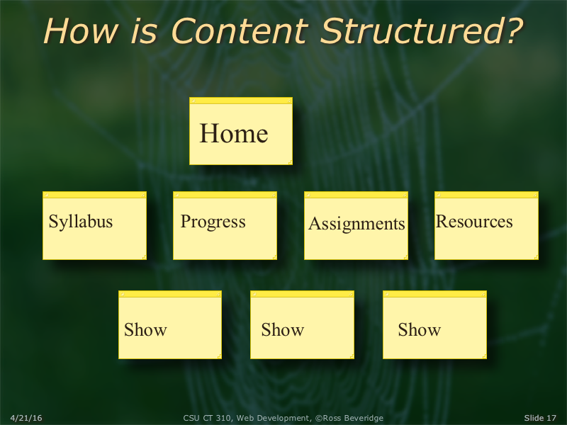

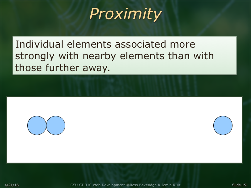
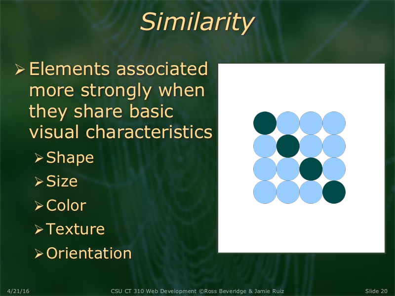

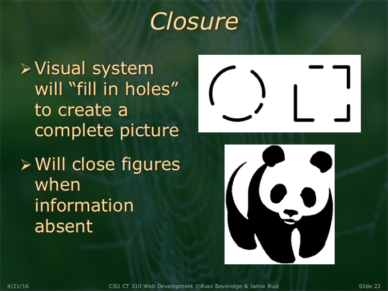
The Gestalt psychologist Kurt Koffka said "The whole is other than the sum of the parts." Our mind sees the whole before it breaks it down into smaller parts. Something to keep in mind when designing a website.
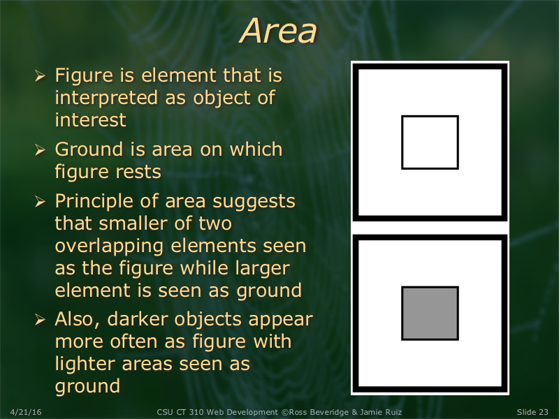
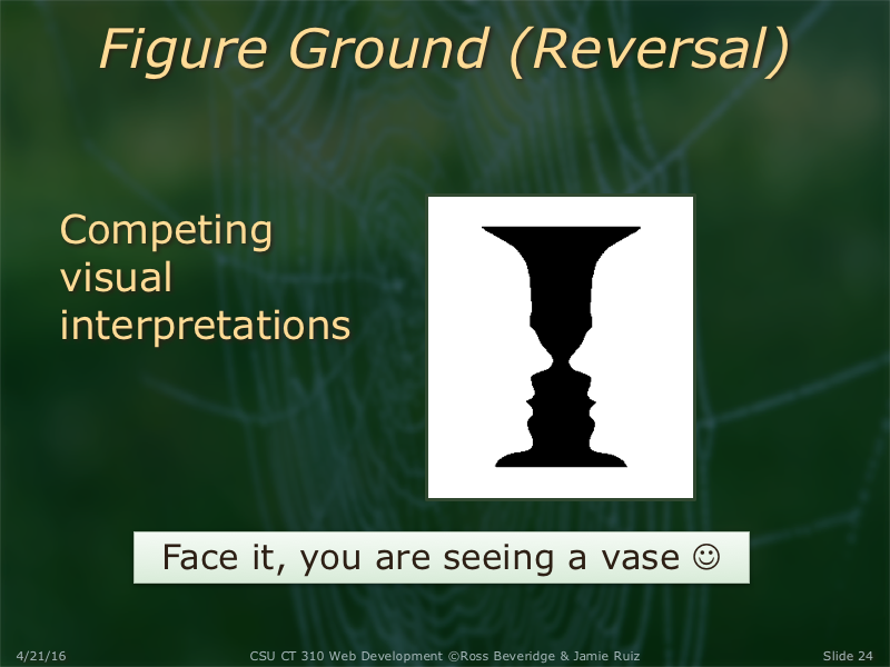
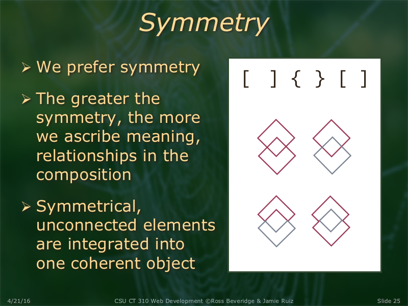
There is some history on Gestalt Psychology here.
One interesting example on symmetry in that webpage is [ ][ ][ ], which is more obvious than the one on the top of the slide to me. In that page it explains "Despite the pressure of proximity to group the brackets nearest each other together, symmetry overwhelms our perception and makes us see them as pairs of symmetrical brackets." Go to the page if you want to know more.
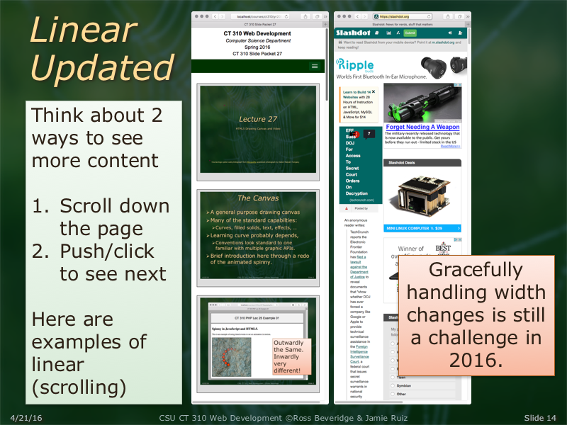
Web design considerations for mobile devices are a little bit different from tradicional web design. There are mostly three things to keep in mind in order to avoid having a poor mobile version of the website:
1- Prioritize website content: with smaller screens, there is no room for needless text, nonessential links or superfluous images, Furthermore, that would just make the website look bloated.
2- Network speeds and data plans: mobile devices' usually have access to slower network speeds and limited data plans. It is essential to limit the number of files sent to the device.
3- Links and image placement: Mobile interfaces are only effective if the user can easily select targets without accidentally tapping other targets.
It is thus crucial that the mobile experience is both functional and natural to the user.
Colorado State University, Fort Collins, CO 80523 USA
© 2016 Colorado State University


