
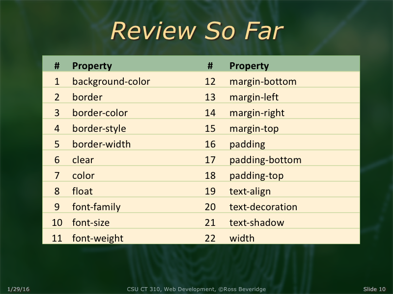
For a great reference to HTML tags and CSS properties, check out W3Schools
These properties can apply to plenty of html tags for css design.
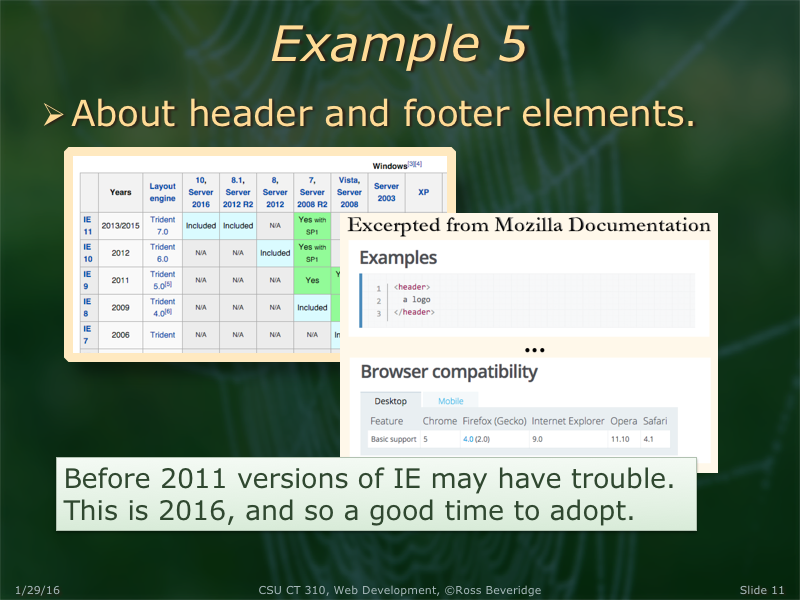
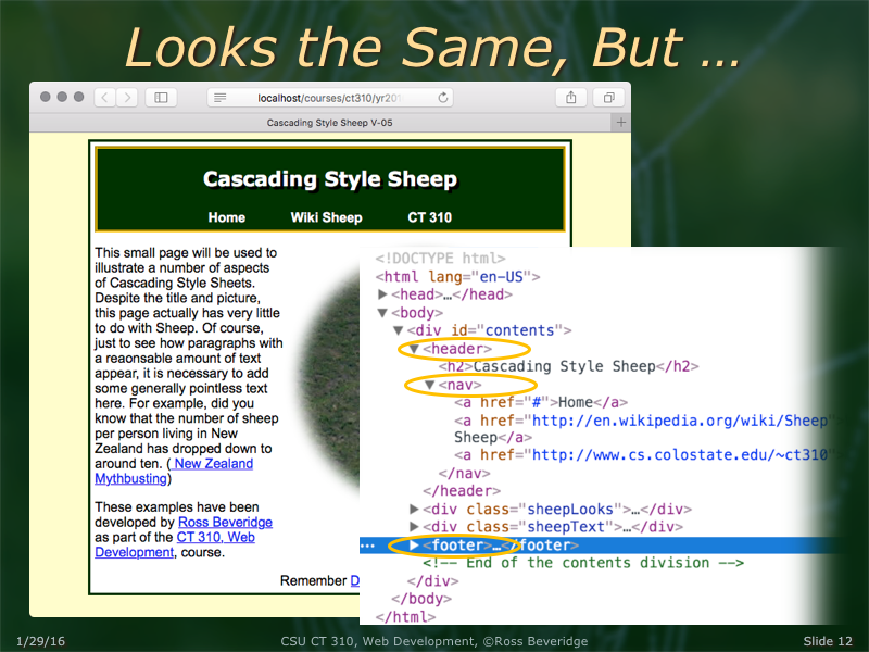
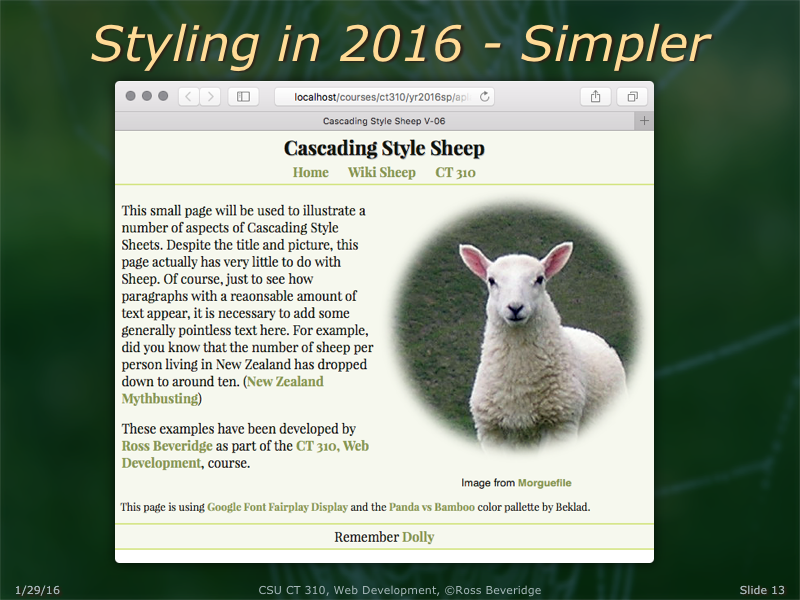
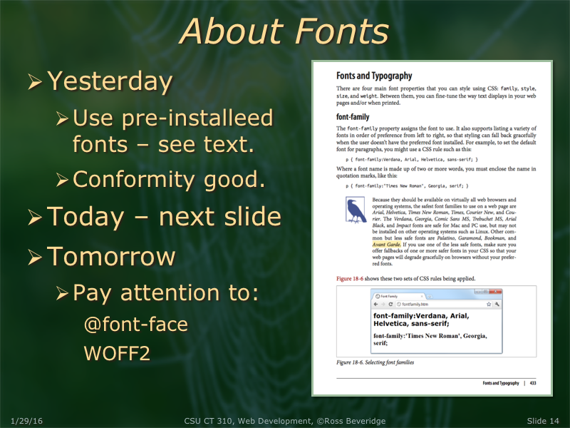
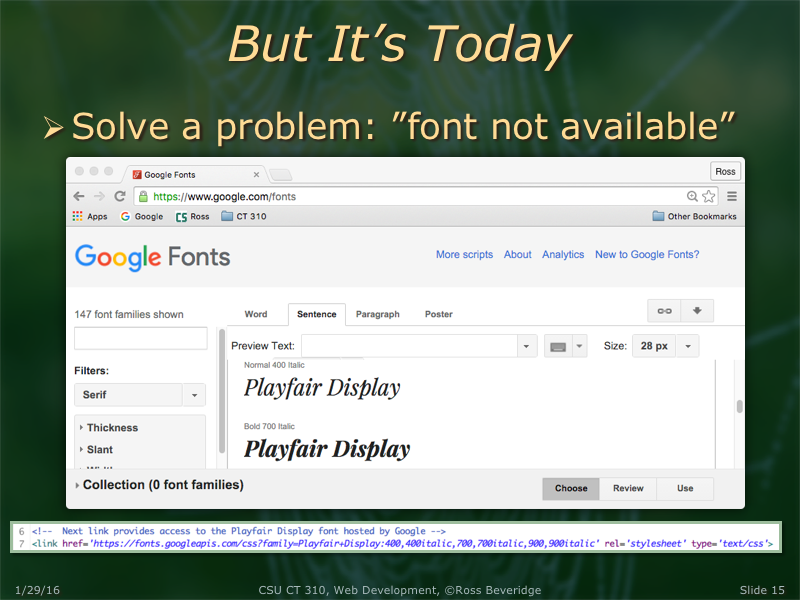
If you want to use a specific font, Font Squirrel has a free generator that will turn TTF and OTF files into webfonts that can be included in your website files and used on the site. This is ideal if you are developing for a client who needs specific fonts in keeping with their brand style guide. Find the generator at http://www.fontsquirrel.com/tools/webfont-generator. (Font Squirrel is also a great resource for free commercial-use license-free fonts.)
Generally Google fonts is the best option because they are used so commonly now that it is very likely they are already cached in the user's browser and thus will load faster.
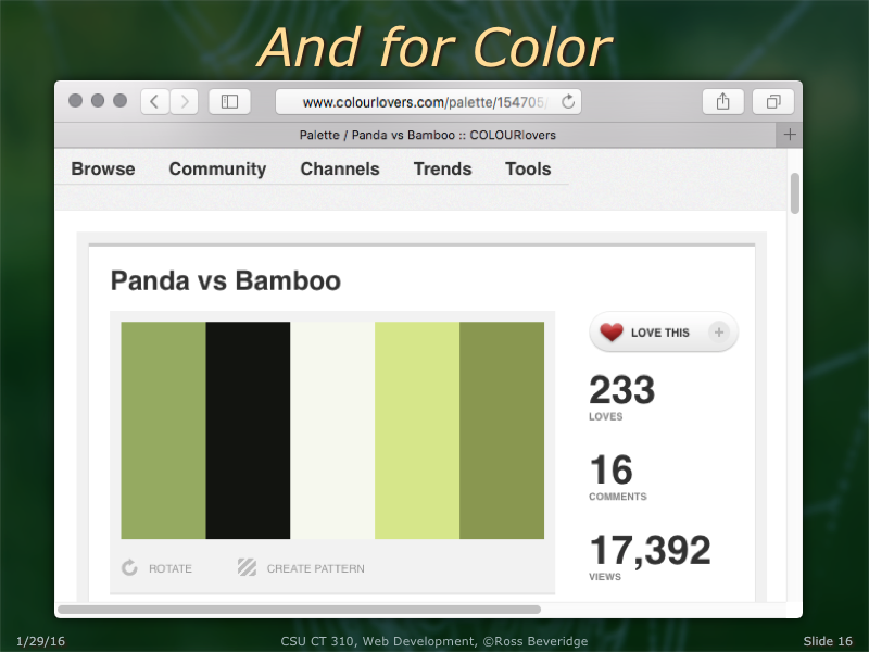
Another great resource for color palettes is Paletton.
Check out this site for a nice interface for choosing modern colors. flatuicolors
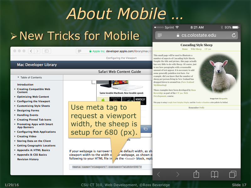
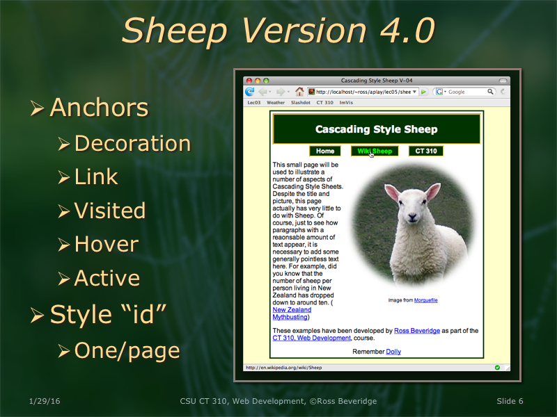
There are fundamental differences between how one handles sizing and more particularly re-sizing on a mobile touch screen versus a desktop window. We cannot in this lecture cover the whole issue in any where near adequate depth. However, you should read the Safari Web Content Guide is a great first resource to begin thinking about the problem. Do notice that there is a meta tag at the head for the sheep06.html example that controls how many virtual pixels across are allocated when displaying the page.
Rather than setting for a specific width, include
meta name="viewport" content="width=device-width, initial-scale=1"
in the head. This will allow for the site to have styles that are more fluid as device or browser width changes.

Check out the new CSU Homepage. This new design came online shortly after we visited the page in Wednesday's lecture.
Colorado State University, Fort Collins, CO 80523 USA
© 2016 Colorado State University

